C1 magazines
Tuesday 17th September 2024

TASK: Greta Thunberg
Jojo siwa
Tuesday 24 September 2024
Do Now
- REPRESENTATION means the action of speaking or acting on behalf of someone or the state of being so represented. or the description or portrayal of someone or something in a particular way.
- Wether it is portrayed positively or negatively.
- A stereotype is a way that someone can be portrayed as an idea or image without knowing them.
- There are two exams in media
- Audiences
Stereotype
- private school boy - rich, posh, well mannered, snobby, spoilt, daddy's money
- grandmother - lonely, old, wrinkles, knitter, slow
- teenager - messy, mean, rude, violent
- naughty
- funny
- ethically diverse
- bad behaviour
- showing students and teacher getting along really well
REPRESENTATION IN MAGAZINES
- masthead - the title
- cover line - tells you whats in a magazine
- main image - biggest image on the cover
- main cover line - the main topic of the magazine
- puff - promotional stickers like
- colour palette - the different colours shown on magazine cover
- direct address - address audience 2nd person eye contact/ directly at camara
- star vehicle - a film written or produced by a specific star to boost popularity of show
DO NOW
- The masthead of a magazine is the title
- The cover line
- A promotional like a sticker
- Wether its portrayed negatively or positively
- stereotypes
RESPRESENTATION IN MAGAZINES
- smart
- beautiful
- bright
COVER 2:
- baddie
- powerful
- confident
- floral
- sweet
- summery
confident
powerful
lively
happy
pretty
DIFFERENCES BETWEEN THE COVERS
- colours
- celebrities
- topics
- clothing
- shot types

Represented
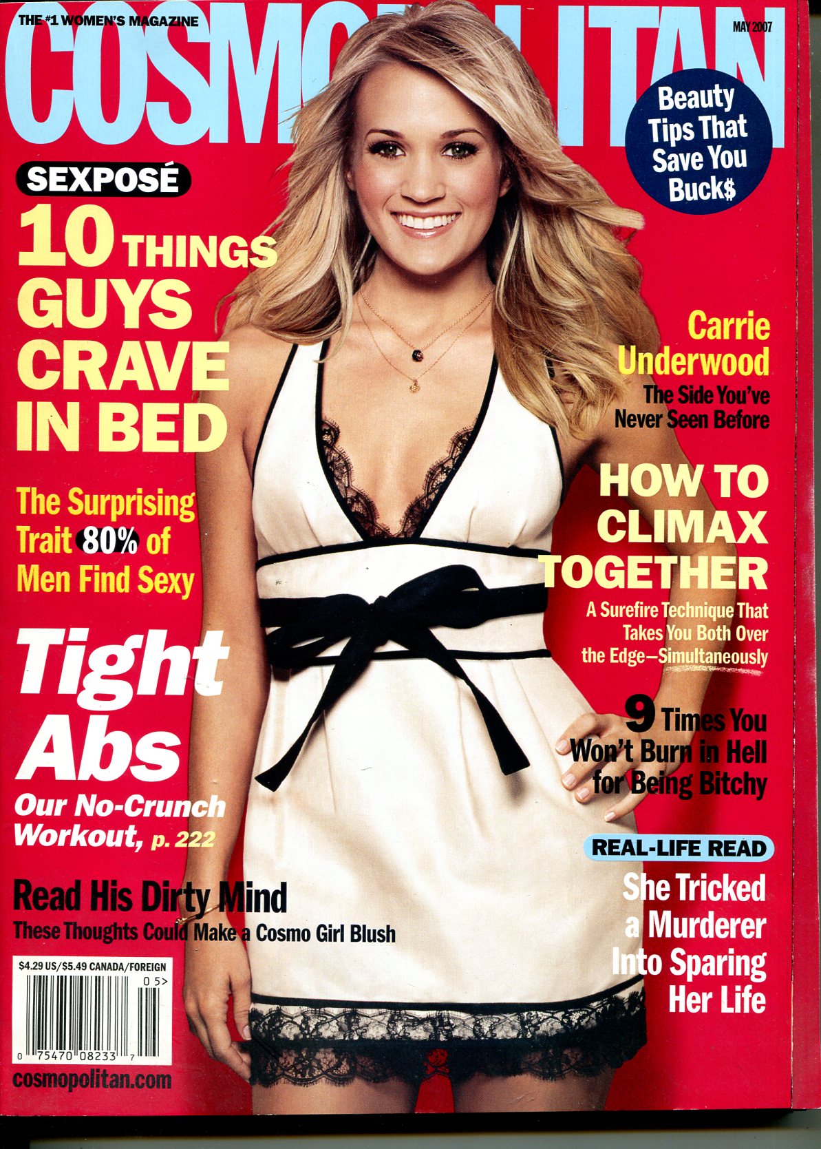
In the GQ magazine cover David Beckham is shown as very masculin and generally stereotyped. He is portrayed with dark colours and sharp font suggesting that men are superior and powerful.Male characters are typically inferred as control of others, aggression, violence and physical appearance.
This contrasts to the carrie underwood magazine cover as she is portrayed as very beautiful, friendly and loving. She is shown as caring about her appearance and the use of colours such as pink and purple represent the common sterotypical colours for females to be referred with.The shot type by including Carrie's body shows how society prefers women. Female character are often shown to care about looks, men, sex and overall friendliness.
Tuesday 8th October 2024
Do now
- bold font to stick out
- addressing the audience in second person /eye contact
- puff
- blue
- objectification- when a person is represented as an object rather than a person
Representation task

Do now
- If it is a positive or negative representation.
- sexual objectification is the process of making treating a person as a sex object to pleasure someone
- Inside game of thrones
- Pink & purple
- Moody, rule breaking, careless, angry, scruffy, lazy
How do you compare representations?
Notes:
- 5 minutes to plan
- List similarities and differences/ judgement
- Use structure to write it!

Example:
In the GQ cover, David Beckham is represented as sophisticated.He is wearing a tuxedo which has connotations of wealth and elegance. This contrasts with the cosmo cover where Carrie Underwood is represented as fun and sexy.
- antisterotyped
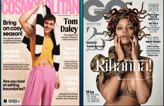
- On cosmopolitan tom is wearing pink
- He is shown as feminine
- He poses in a feminine way
- But he is still shown to be masculine by showing off his muscles.
- GQ sexually objectafises Rihanna
- She has dark colours
- She is mostly naked
- She is posed in a sexual way
- she is represented as powerful
- She was represented as medusa
- Stereotypical male topics
Tuesday 12th November 2024
Vogue
- The magazine was launched in 1892
- The original target audience was The New York upper class
- Over the years vogue has changed to a glossy, monthly, woman lifestyle consumer magazine
- Conde Nast
- Vogue is a multiplatform
- total circulation - 1250 845
- readership - 2.7 million individuals
- target audience - affluent, fashion, enthusiasts, abc1 female audience, 25-45
- popular, fashionable, bright

QG
- It was published in 1931/ rebranded in 1967 as GQ
- The genre is men style
- Yes more women have been in the magazines
- The publisher is conde nast
- It is a multiplatform
- readership - 1.8 million
- circulation - 89,072
- target audience - male fashion
- sharp, smart

Case study 1: Raheem sterling
GQ targets the audience by showing the men as superior ands powerful rather than the women who are sexualised.
Full Name: Raheem Shaquille SterlingDate of Birth: 8 December 1994Place of Birth: Kingston, JamaicaHeight: 5 ft 8 in (1.72 m)Position: Forward / WingerCurrent Team: On Loan- Arsenal [Chelsea FC] Tuesday 26th November 2024
Do now
- ANCHORAGE - the words seen with with an image
- Analysing Typography - what the text looks like and why?
- cover lines tell you what the magazine is about.
- sans serif
- most often used in magazine cover is medium close up
- Born: 8 December 1994 Kingston, Jamaica
- Current team: Arsenal F.C.
- Position: (#30 / Forward)
- Children: Tori-Sevyn, Thai-Cruz Sterling
- Height: 1.72 m
- Partner: Paige Milian
- Parents: Nadine Sterling

Tuesday 3rd December 2024
Do Now
- Raheem Sterling is a footballer.
- Colour and font type/ how it looks.
- Racism.
- Serif.
- Anchorage text.
Tuesday 10 December 2024
Do now
- Explain what the magazine is about.
- Lear people into buying the magazine & shows a picture that links to the story.
- Racism in football.
- Below the subject, looking up.
- Convention is the way in which something is normally done.
Improvement week
The main image represents shows sterling as proud and powerful as he standsing in a confident stance, with a large pair of black wings indicating his role as a protector and guardian towards racial abuse in football. This connotes his strong views on the way black footballers have been treated throughout football games. He is looking at the camera as the low angle shot with a serious and rebellious face which directly addresses the audience.
(c) Lastly the GQ cover page is filled with a contrast of colour between white, black and gold. These colours infer darkness and light with the use of the musty gold it shows importance and rarity. The layout is dotted around Raheem sterling making the image of him pop and display right at the reader.By using contrasting colours of black and white next to each other shows difference and change.
Tuesday 17th December 2024
DO NOW
- suggests
- black angel
- abc1 male
- attract the buyer
- Rules or generally accepted ways of constructing form and informing meaning in media products including story principles, form and structure, generic structures, character and story arcs, cause and effect, point of view, the structuring of time, elements of page layout, paper stock for print, titles and credits
DIRT WORK
GENDER:
- powerful
- strength
- tattoos
- muscular
- wealth
- rebellious
- status
- low angel shot
- protective
- all men are represented as successful
- angel wings show religion
Tuesday 14th January 2025
DO NOW
- Malala is known for getting shot in the head by the Taliban.
- June 2021 the American and Britain troops were ready to leave Afghanistan.
- ABC1 Female
- No
- No
Masthead;
- Serif
- Professional, feminine
- The prevailing fashion or style at a particular time
- Giving the front cover a bigger impact on the magazine
- In this edition the masthead is laid over Malalas forehead, but due to her being an unlikely model for a fashion magazine this anchors her as a vogue star as well as the writing which is also in grey saying 'survivor, activist, legend'.
- White, because its her name.
- Powerful, strong, brave.
- The grey writing represents wealth and strength.
- Typical magazine layout
- Z shape layout (codes and convections of magazine covers)
- Drawn towards eyes and face
- Hands leading up to her face
- They have all used a similar didot font (black and white)
- Italics (feminine)
- serif font
- Block capitals
- 'fighting' relates to the war in Afghanistan
- Captures your attention
- 'love after lockdown' alliteration
- medium close up, shows dominance and highlights her face
- Wealth, religion (muslim), war, power
Tuesday 21st January 2025
Do Now
- Z shape
- A boxer
- Medium close up shot
- Direct address
- Royalty, wealth, power, love
Cover analysis: media language

Firstly, it show cases her face by using a Z shape layout. This layout makes her face pop and more capturing to the audience. The Z shaped pattern assumes that the reader will view the middle of the cover first whilst being followed by looking at the corners at the coverlines. This layout is significant as it allows the Vogue text to be highlighted over her forehead.
In this edition the masthead is laid over Malalas forehead, but due to her being an unlikely model for a fashion magazine this anchors her as a vogue star as well as the writing which is also in grey saying 'survivor, activist, legend'.The use of the serif font in the mass head infers the professional and feminine look that the magazine aims to intice there ABC1 audience. The grey writing can connate modesty and sophistication of Malala as a person.
The image on the front cover is a medium close up which adds to the idea of importance within her society and what she is known for. The medium close up shot is able to capture her face expression and body language. Her facial expression shows to be very serious and dominating showing how she can stand her ground. The way that Malala poses with her hand up to her face, draws attention to her face and shows a sense of power and dominance. The vogue cover also shows Malala in a bright red hijab. The colour red can infer love and royalty within here as well as a past of blood and pain. Red sums up her life story. Wearing a hijab in the image allows the viewers to be aware of her religion (muslim) and her ethnicity.
Aswell as the image, the coverlines also are important due to the purposeful way that they are put on the front cover. They all use a similar didot font of black and white in italics connotating the feminine feel of the magazine. All the coverlines are in a serif font with block capitals with captures your attention and intice the audience to read further into the magazine.
Exam Question
The image on the front cover is a medium close up which adds to the idea of importance within her society and what she is known for. The medium close up shot is able to capture her face expression and body language. Her facial expression shows to be very serious and dominating showing how she can stand her ground. The way that Malala poses with her hand up to her face, draws attention to her face and shows a sense of power and dominance. The vogue cover also shows Malala in a bright red hijab. The colour red can infer love and royalty within here as well as a past of blood and pain. Red sums up her life story. Wearing a hijab in the image allows the viewers to be aware of her religion (muslim) and her ethnicity.
Tuesday 28th January 2025
Do now
- How the media chooses to represent the world to us
- If its positive or negative
- Muslim
- No
- Wealth, power, love, royalty
Representation
In the past muslims have been represented as villains and extremist. They are seen or shown as the villains and tend to always be male and violent. They are almost never shown as homosexual, disabled or female.
In terms of ethnicity, the vogue cover shows diversity.
- In the past vogue represents women as people who are only related to fashion.
- Malala presented on the cover - anti stereotypical ( diversity of religion)
- Presenting women as powerful
- Topics stereotypical female. (makeup, skincare, jewellery)
Tuesday 4th February 2025
Do now
- diversity
- 'fight talk'
- As feminine, confident, gentle
- power and strength
- violent, mean, villainous
Comparing
- women have been represented as intelligent due to the coverlines talking about politics and mentioning a member of the government Kamala harris.
- Elle - Kim kardashian / powerful
- Vogue - Lizzo / bold (connotation from colour red)

SIMILARITIES
- sophisticated
- independent
- bold
- confident
- strength
- royalty
- high status
- feminine
- red clothing
- shot type
- represent different topics/themes
- lizzo based on looks
- malala based on religion


Tuesday 11th February 2025
Do now
- Similarities and differences
- Opinion
- 5
- A magazine cover you are familiar with
- media language or representation
25 mark question

Differences;
- stance
- camera shot
- colours
- san serif/serif font
- cover line topics
- clothing
- religious representation
- Kim k is represented in a sexy way whereas malala is shown as highly religious and serious
Similarities;
- gender
- serious facial expression
- feminine
- provocative
- powerful
- dominant
- educated
- Bold fonts
There are more differences than similarities in the two covers.
Question 1; 5 mark question = 2 points
1d) The vogue front cover uses layout and design to communicate the meaning that Malala is not only a 'survivor, activist and legend' but also interested in more feminine deemed content such as love. The vogue front cover represents the z shape layout beginning at the top of the page where the vogue text is shown in bold, pale grey, serif font over Malala forehead. The cover lines as well as the main cover lines are shown in different colours to contrast the red background with white and black. This makes the more important text to pop at the reader.
2a) social context = what is going on in society the time the text is written.
Social context influences magazines because they want magazine to be relevant to society so there readers will buy it and be interested. One example of social context influencing magazines is after just coming out of lockdown people wanted to know what was happening in the world due to people not being able to go out so the theme of lockdown drew peoples attention.
2b)
Good notes.
ReplyDeleteREPRESENTATION TASK: Great cover, clearly showing an understanding of representation.
COMPARISON TASK: A good first attempt. Some comparison supported by reference to the two texts.
INDUSTRY RESEARCH: Good notes
GQ COVER ANALYSIS: Great work!
WWW: You’ve clearly analysed elements of media language with connotations
EBI: make sure you include detailed reference to the cover
VOGUE COVER ANALYSIS: Brilliant – much better!
WWW: You’ve clearly analysed elements of media language using connotations
EBI: try including CONVENTIONS
25 MARK COMPARISON Q: 17/25 Good work!
WWW: you’ve clearly identified differences and analysed them
EBI: make sure you include specific examples from the covers in ALL your paragraphs
TARGET 1: Add more detail to your answer
DIRT: Add in analysis (connotations etc) to your last two paragraphs